Give the site's inner pages a compact header and a centered column
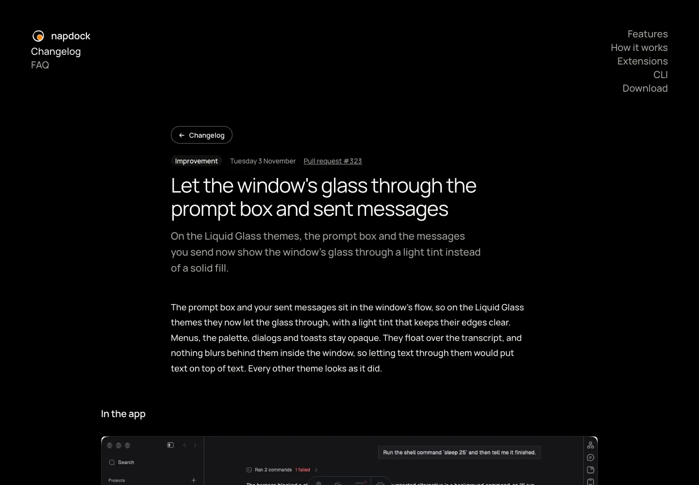
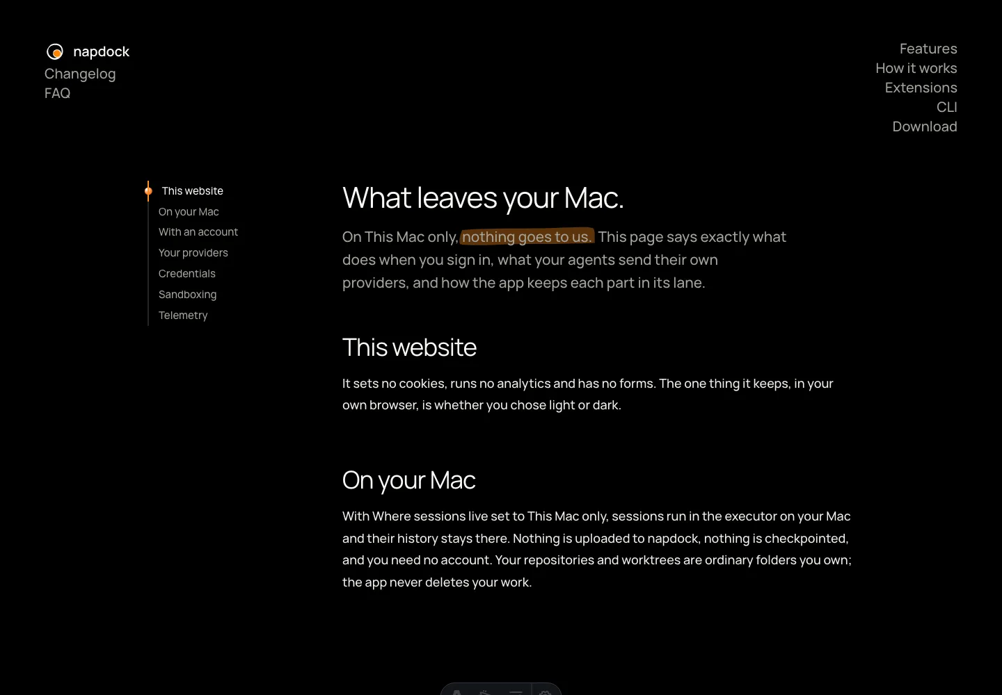
The site's inner pages open with a compact header instead of the homepage's hero, read in one centered column, and list their sections down the side rather than across the page.
Every inner page used to open with the homepage’s largest heading, so the page itself started near the bottom of the first screen. They now share one compact header, with a heading small enough to leave the page room to start.
Privacy, the FAQ and the CLI reference read in one centered column, with their sections listed in a column beside it that fills as you read. Changelog entries keep their text to that width and give screenshots a wider one. The sections list no longer runs across the page as a row of links, and it no longer repeats the page’s name above it.
A changelog entry’s way back is a button. Once you scroll, the bar along the top keeps Changelog and the FAQ beside the brand, so the page you are on stays marked. The terminal titles on the CLI and Extensions pages are drawn at their own small size again.
In the app