Make Liquid Glass clear and draw its controls as macOS does
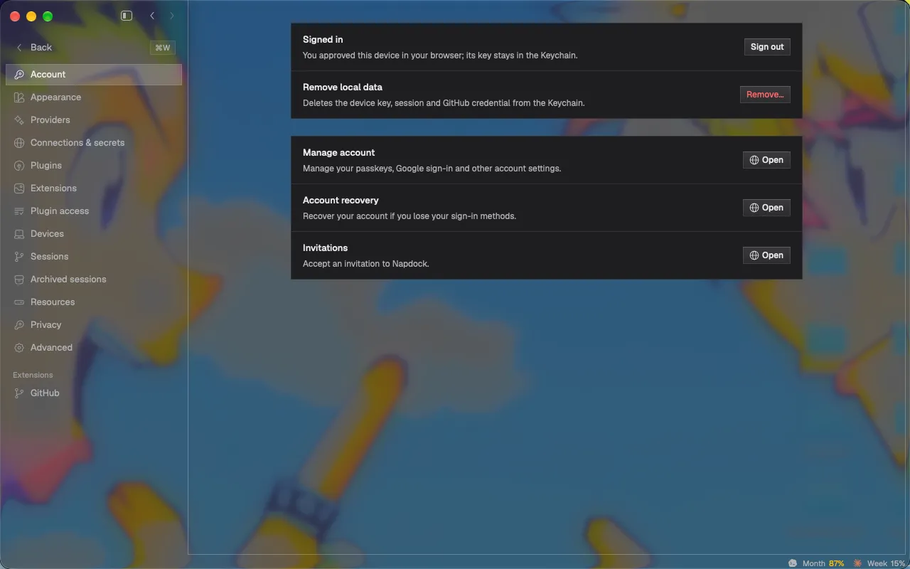
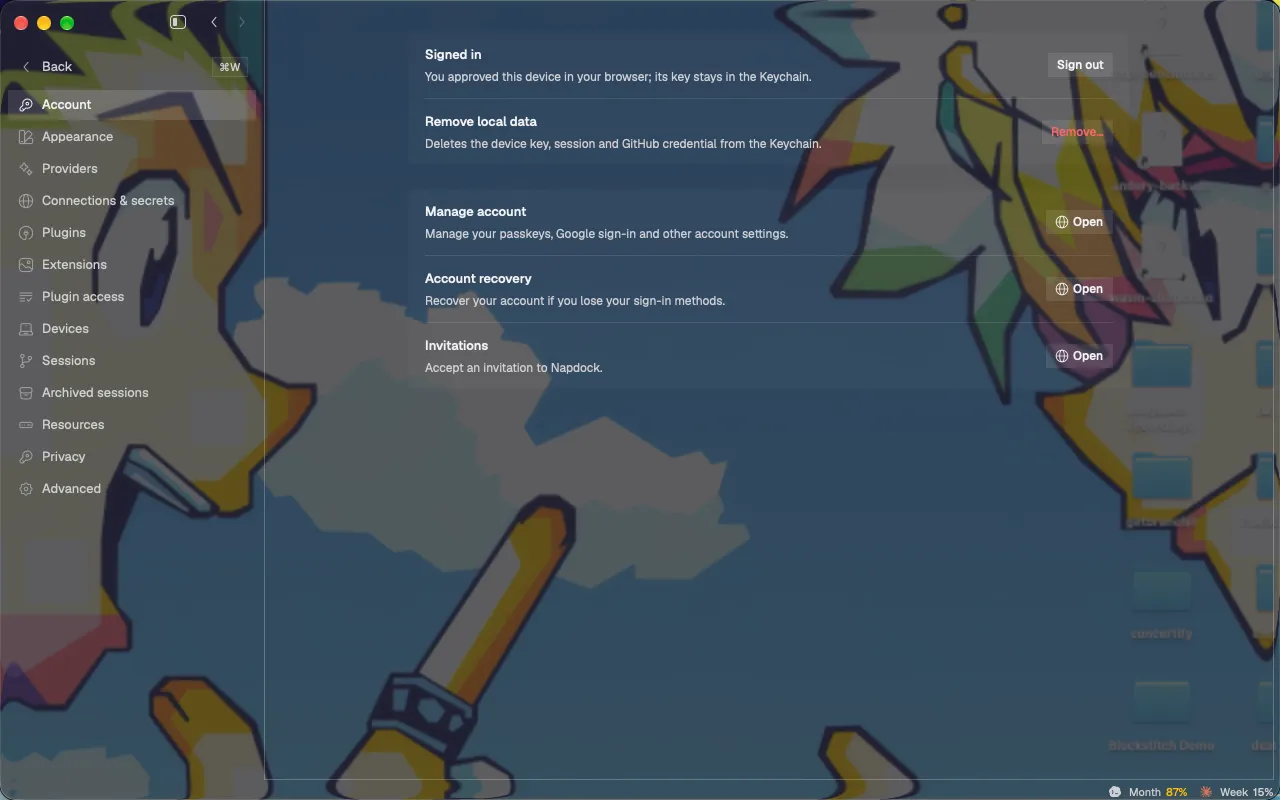
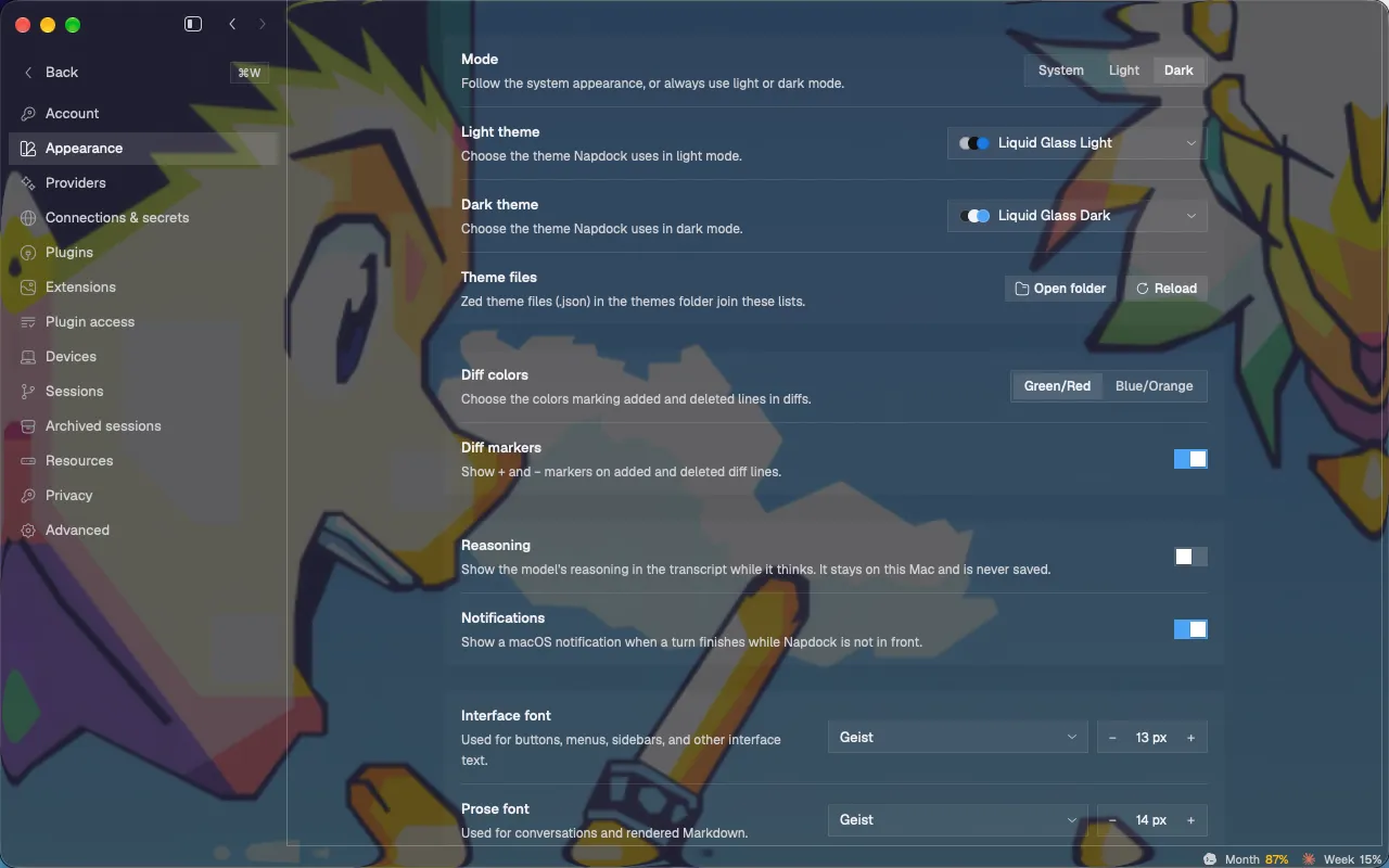
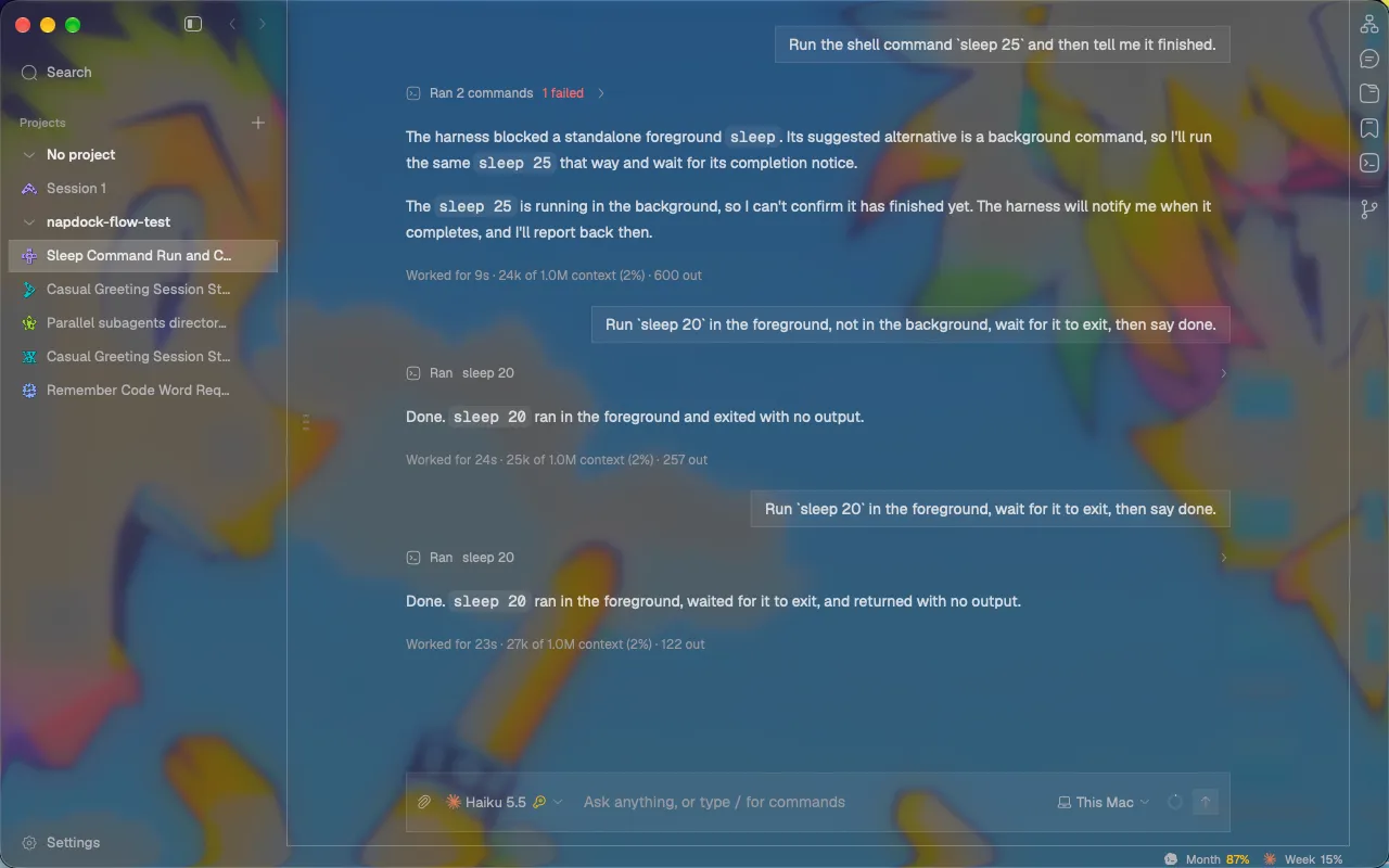
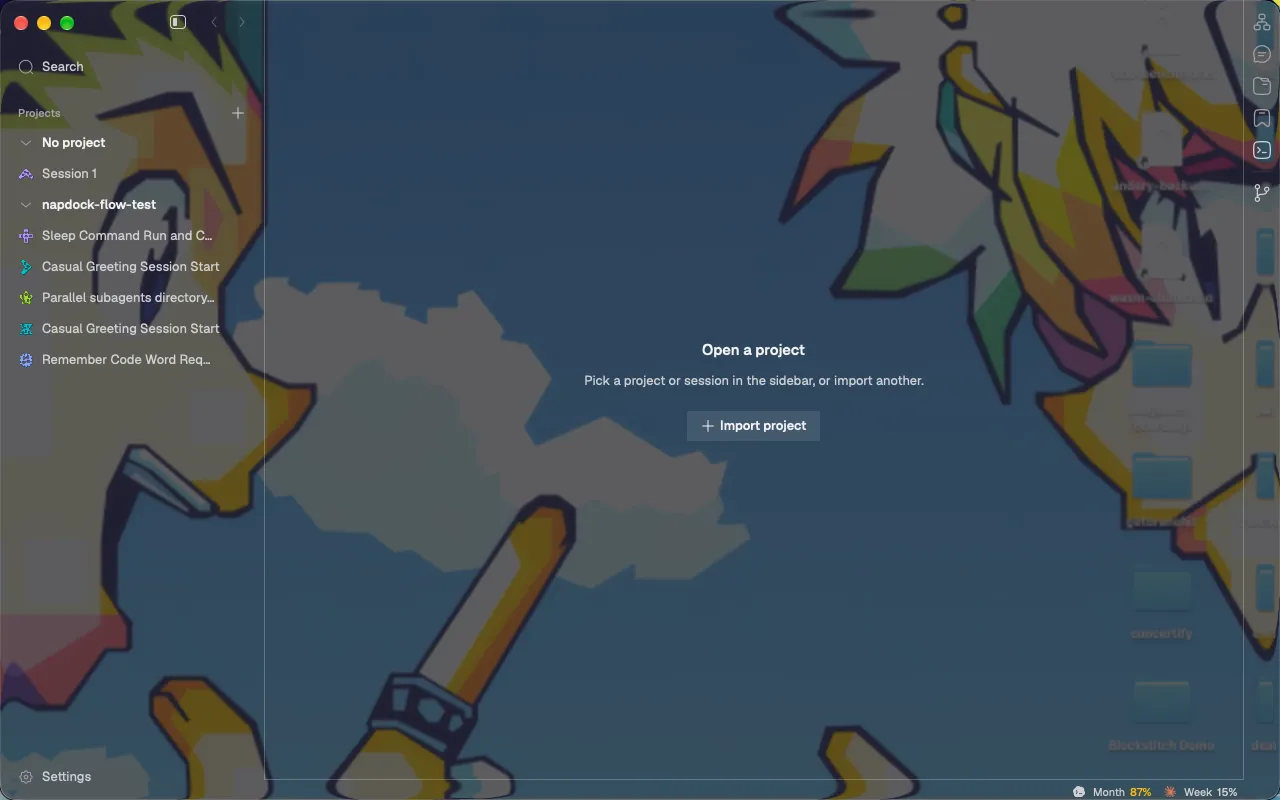
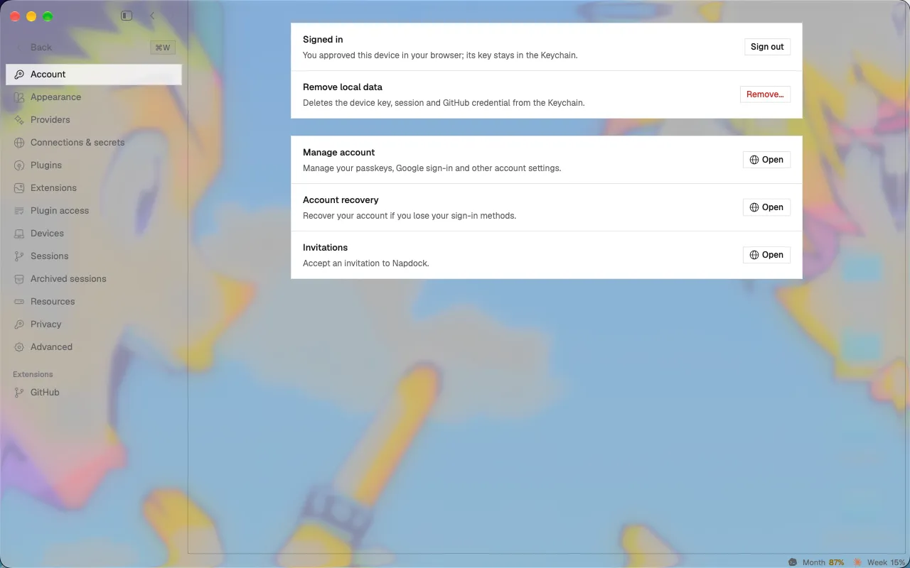
The Liquid Glass themes now let the desktop show through clearly instead of frosting it, and their settings lists, buttons and selection look the way macOS draws them on glass.
The Liquid Glass themes used the heavier of Apple’s two glass styles, which blurs the desktop almost as much as the plain blur, so the window looked frosted. They now use the clear style, with a darker or lighter tint behind it so text stays readable over a bright or busy wallpaper. Secondary text is a little stronger for the same reason.
Settings lists and cards, buttons and the selected row now follow what macOS draws on glass: a faint fill with no outline for groups, flat tinted buttons, a soft fill for the selected row, and the accent blue for the main action and for switches that are on. Other themes look as before.
Napdock also follows the macOS Reduce Transparency and Increase Contrast settings. With Reduce Transparency on, the window’s glass turns solid; with Increase Contrast on, secondary text gets stronger and lists get outlines.
In the app