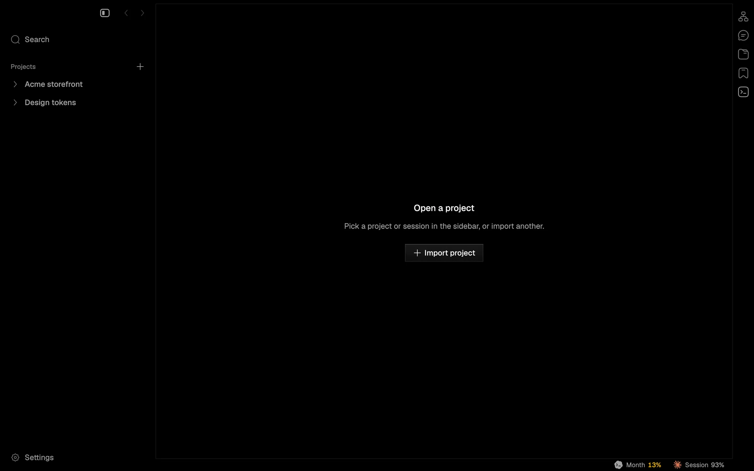
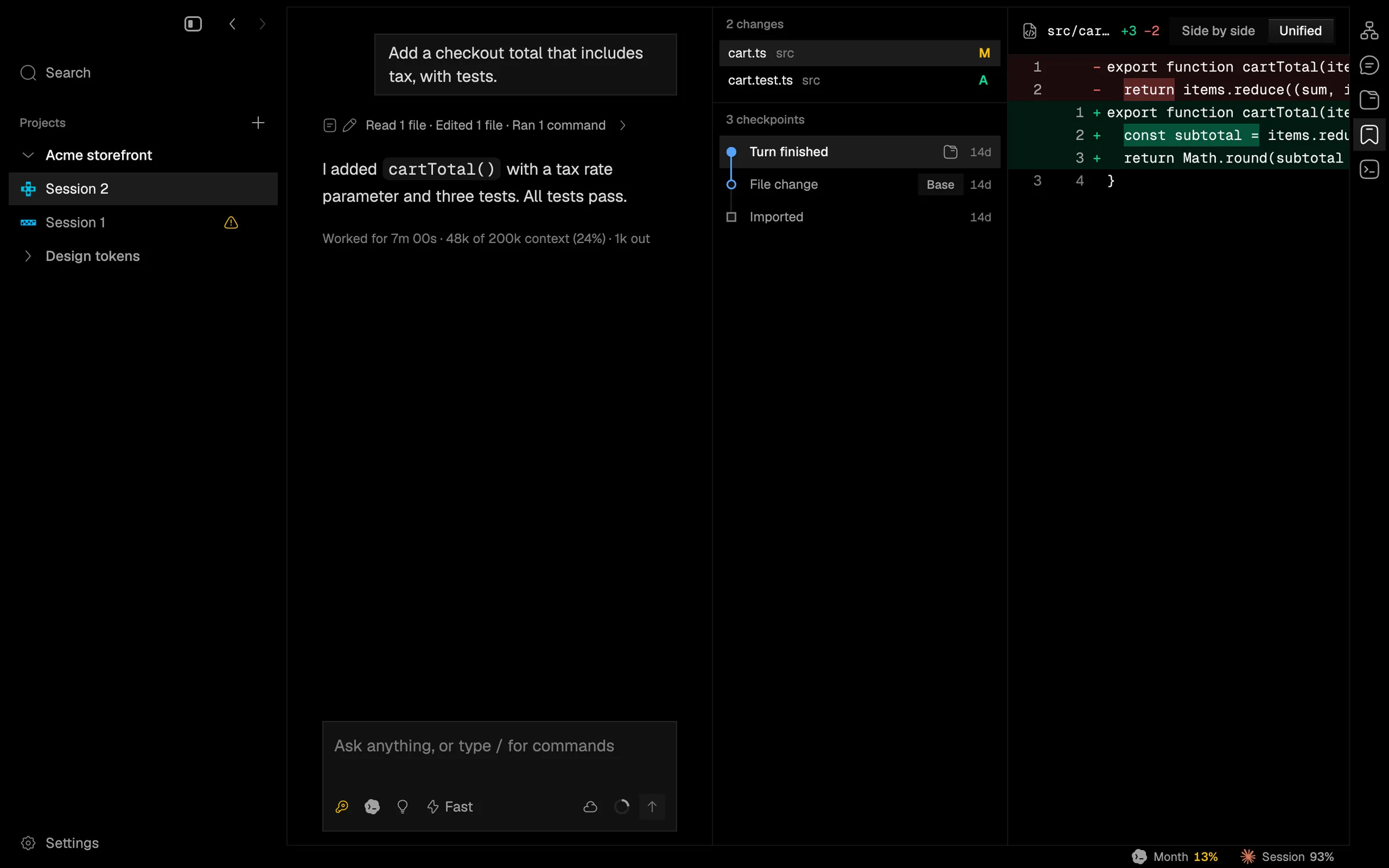
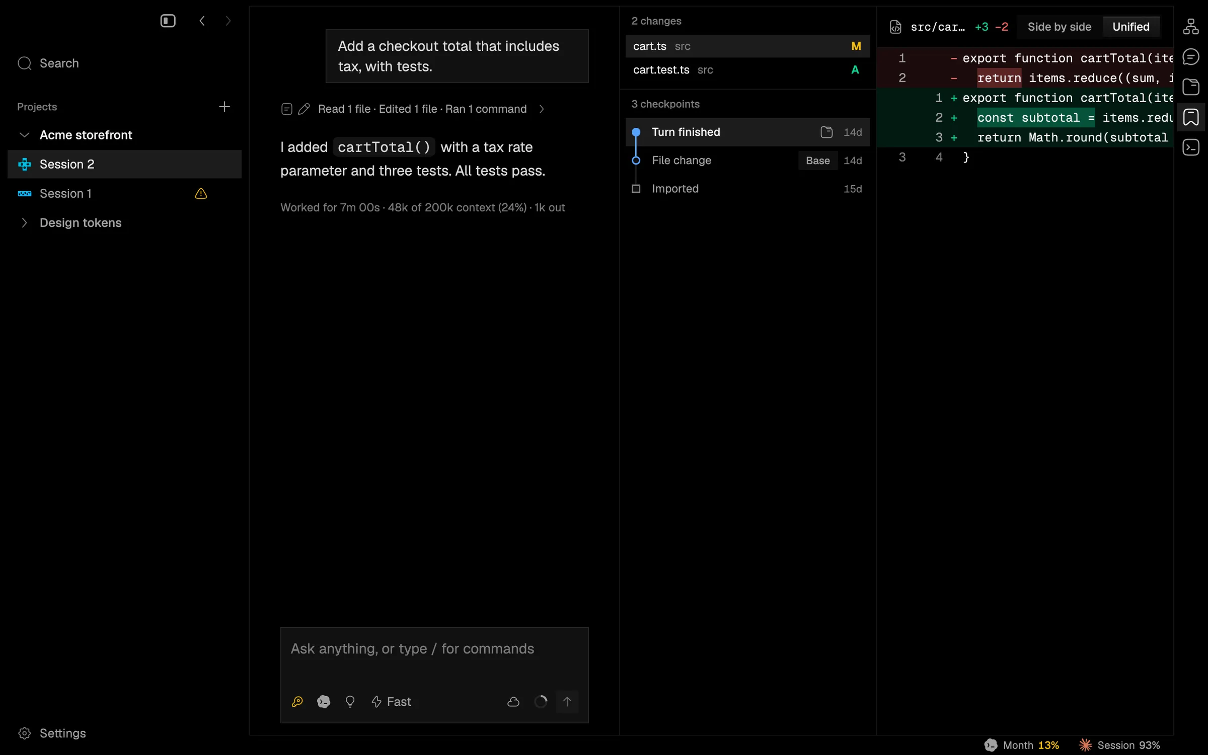
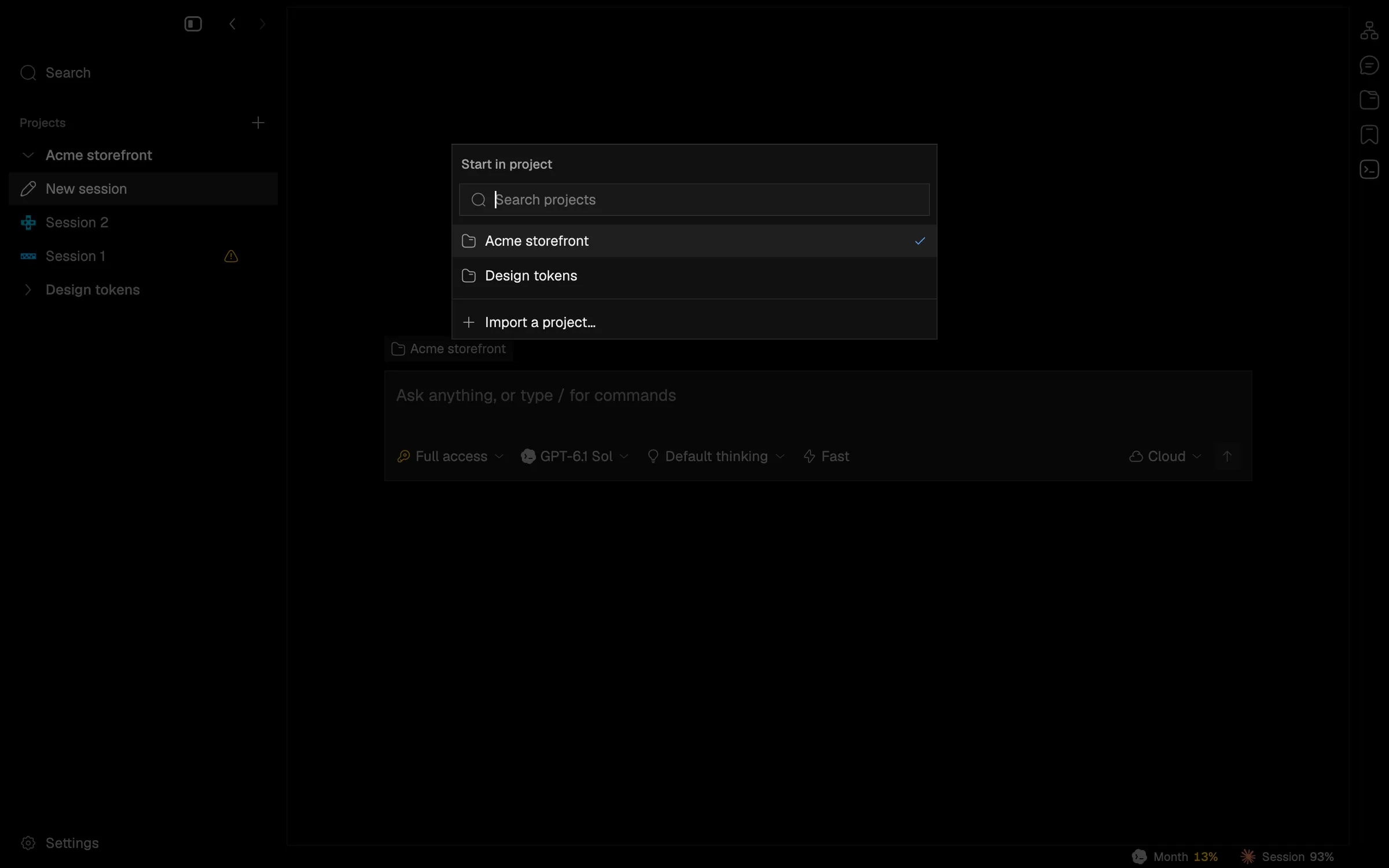
Rebuild every control on gpui-kit primitives, same look
Buttons, switches, menus and rows now share one focus, keyboard and accessibility behavior, with no change to how they look.
Each of Napdock’s buttons, switches, segmented controls, steppers, dropdowns, menu items and clickable rows used to wire up its own focus, keyboard and disabled handling, slightly differently. They are now all built on one set of unstyled gpui-kit primitives, while Napdock’s own theme still draws every pixel. The look is unchanged.
What changes is behavior at the edges:
- Enter and Space activate on key-up everywhere, the platform convention.
- Disabled controls take no click and leave the tab order, for assistive tech too.
- Every pressable surface exposes a role and a label.
In the app